Part 4: Content
Let's start adding some content to this template.
First, download harmonicInstructionText.txt
Google fonts
Going back to InDesign, we check the font usage and see that we are using Niconne for the headlines, Georgia for the body text, Open Sans Bold Condensed for the subheads and Open Sans and Open Sans Bold for the text in the <aside>. Georgia is a standard Mac and PC font, so we won't have to install it, but we will need to go to Google Fonts and install Niconne, Open Sans Bold Condensed and Open Sans 400 (regular) and Open Sans 700 (bold). Remember to install the links to the fonts in the <head> element just above <style>, and then we'll add the css in the appropriate elements.
Instructions for installing Google Fonts
Organizing your css
Let's add some divisions in our css before we get much farther. Under the opening <style>, add:
/* STRUCTURE */
Then scroll down to just before the first @media media query, add:
/* TYPOGRAPHY */

			/* LINKS */

			/* MEDIA QUERIES */
Adding content to the header
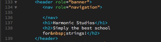
Go to the text file and copy and paste the header text in the header AFTER the <nav>. Make "Harmonic Studios" an <h1> element and "Simply the best school for strings!" an <h2> element.
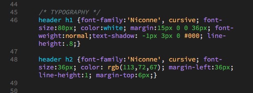
header h1
Go up to your css under /* TYPOGRAPHY */, hit a return and add header h1 {}. (I'm being specific here because I might want to use <h1> elements elsewhere in my document.) Then we'll add the following properties:
font-family:'Niconne', cursive; font-size:80px; color:white;
Two immediate problems: The type is too close to the edge of the box, and the font weight seems heavier than on our original design. The first problem could be solved by adding 20px padding to the <header>, but try that and what happens?
Since we have the <nav> inside the <header>, the padding affects the <nav> also. So since we can't push the text in from the <header> using padding, we'll use margin on the <h1> to push it away from the <header>:
margin:15px 36px 0 36px; (adding padding to the top, left and right; the right margin is for much narrower browsers)
The font weight is heavy because <h> elements are usually bolded automatically by the browsers. (We have been using a reset of * {padding:0; margin:0;}; there are more complex resets that reset more of the inconsistencies between browsers, such as the <h> elements' font weight. Some of them are explained here.) So to make the font less bold, we add this css:
font-weight:normal;
Next, we're going to add a shadow to the type:
text-shadow: -1px 3px 0 #000;
(first number is the movement of the shadow on the x-axis, second is movement on the y-axis, third is the blur on the shadow, and fourth is the color of the shadow.)
Finally, we want to cut down on the leading between the <h1> and the <h2>; we'll use a tighter line-height to close them up a little. (We could also use a negative margin on the top of the <h2>, but that won't work as well once we start playing with the mobile version of the site.) So add:
line-height:.8
header h2
Next, we'll go back to our InDesign document and get the specs for the <h2>, which are font size of 36pt and color of rgb 114, 72 67. So we'll add:
header h2 {font-family:'Niconne', cursive; font-size:36px; color: rgb(113,72,67);}
Then we're going to add the same left margin that we added to the <h1>:
margin-left:36px;
Then we're going to keep the leading tight (you'll see why), but keeping it tight makes it too close to the <h1>, so we'll add some margin at the top to move it down:
line-height:1; margin-top:6px;
Effect of mobile on the header
Next we'll see what happens when this header meets a mobile device. Open this site in a browser window, and make the window narrower and wider. You'll see our two breakpoints in operation. At the first breakpoint, it looks like this:

The obvious problem is with the violin extending into the type. So let's go down to the first @media and move the violin to the right. Try this:
header {background-position: 470px 67px, left top;}
It's not a great design, but it reduces the problem with the type not reading over the violin. Perhaps a better way would be to swap the background image to one that fits the space better, which is also possible, but we'll go with this for now.
Next we need to check out breakpoint 2. Make your browser narrower until breakpoint 2 cuts in, and then make your browser window as narrow as you can. At the initial breakpoint, there's not much of a problem, but at narrower sizes it does this:

So our headline text extends out of the <header>, and the background is so white that the type becomes hard to read on the right.
The text comes out of the <header> because we have a fixed height on the <header>. Go up into the /* STRUCTURE */ css and remove the height: 200px; from the header attributes, and suddenly the <header> contains the headline text:

The only problem is th bottom of the header is too close to the <h2>. So we can either add margin-bottom to the <h2> or bottom padding (which won't affect the <nav>at the top) to the <header>. I'd recommend adding padding to the bottom of the <header> in case something else changes in the <header> later.
That still leaves the problem with the gradation. There's two possibilities here; go back and edit the gradation to make it darker on the right from the beginning, or "cheat" the gradation, make it wider than the box so it's darker on the right when we hit breakpoint 2. I like the lightness behind the violin at 1200px wide, so I'm going to change the width of the gradation at breakpoint 2. Go to the @media for (max-width:768px) and change the background-size to:
background-size: 150% auto;

Typography refinement
Notice how, on the last line of the <h2>, there's only one word, "strings"? This is poor typography. Good typography in all cases, print or web, would have at least two words on the last line. (Unless the word was "antidisestablishmentarianism.")
To accomplish this, we can use something called a "non-breaking space", which looks like this: . If we place the non-breaking space code in between the two words with no spaces, like this — for strings! — then the "for" and the "strings!" will stay together no matter what and both will break to the next line when there's not enough space for both, like this:

There are lots of other special characters; for instance, go to https://www.w3schools.com/charsets/ref_html_8859.asp and look down the list for characters with "entity names". Characters include © and ®.
Note: Perhaps the most important thing to realize is that you don't want to type "&" in your text, because & is used for the beginning of an entity name; you want to code & instead.
Main
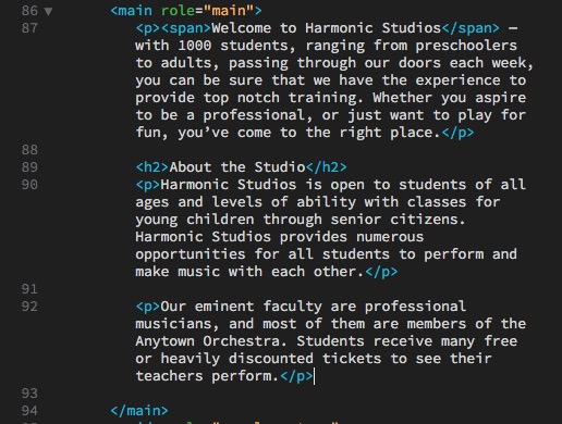
Paste the text from the text document from just below "main" to just above "Support Classes" and paste it into the &th;main> element. Wrap everything in <p> elements except "About the Studio", which should wrap in an <h2> element. Then wrap a span element around "Welcome to Harmonic Studios" in the first line of the first paragraph. It should look like this:
The first thing we'll fix is the text running into the side of the textbox. Since we don't have other elements interfering with it, and since the box-sizing = border-box, we can add 36px of padding all around (to match the indent in the header).
Add to main in /* STRUCTURE */: padding:36px;
Now let's go back to InDesign. When we click on the body text in InDesign, it says it's 16pt Georgia on 22pt leading. If we divide 22/16, we get 1.375. We have also removed the extra spacing in our text when we added the margin:0, padding:0 reset, so we need to add one line space (22pt) after our paragraphs. Go back to Dreamweaver and add to our /* TYPOGRAPHY */:
main p {font-family:georgia, 'Times New Roman', times, serif; font-size:16px; line-height:1.375; margin-bottom:22px;}
Then we go back to the subhead "About the Studio" in InDesign. It's the same font and color as the <h2> in the head, and it's 36pt with 32pt leading (when divided, that's .94, close to the line-height of 1 we used for the header <h2>). The only difference is in the padding and margin, so we might as well use the css over. And — funny! — the <span> is also the same dimensions. Rewrite the header h2 to add the main h2 and the main span, and then write a header h2 just for the two exceptions:
header h2, main h2, main span {font-family:'Niconne', cursive; font-size:36px; color: rgb(113,72,67); font-weight:normal; line-height:1;}


			header h2 {margin-left:36px; margin-top:6px;}
Adding the image and wrapping text around it
Place your cursor just before the <h2> "About the Studio" and go to Insert>Image, go inside the images folder and select "student.jpg". (Remember to fill in the alt="" text so that people who can't see will know what the image is of.)
Note: the image stacks just like any standard element. But in this case we want the text to wrap around it. If you remember the previous discussion on floats, you might remember that wrapping text around images was the initial purpose of floats, so we can try that. It's also likely we'll need to float a bunch of images throughout this website, so let's create a couple of classes to handle our floats.
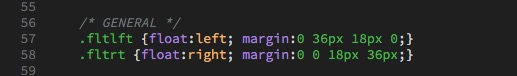
First, we're going to create another category in our css. Before /* MEDIA QUERIES */, add:
/* GENERAL */
Then, under /* GENERAL */, add:
.fltlft {float:left; margin:0 36px 18px 0;}

			.fltrt {float:right; margin:0 0 18px 36px;}
These classes will float the elements left or right, and add padding on the text side of the image. (Images generally look better if there is less space above and elow them than on the sides.) Now add a class="fltlft" to our image like this:
And it looks like this:
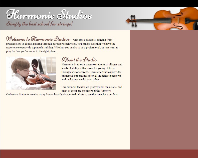
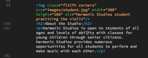
Finally, in /* GENERAL */ let's add a class for rounded corners we can use on images and boxes:
.corners {border-radius:12px;}
And add the class to the img element. When you add additional classes or ids to an element DON'T add a comma, just add a space (which is one reason why you can't have a space in a class or id name).
Add articles
At the end of the <main>, add two <article role="article"> elements, and place the two remaining articles from the main section of the text file inside them. Wrap the headlines in <h3> elements and the text in <p> elements.
The css for header h2, main h2, main span is the same code we need for the article h3s, so add ", article h3" to the css and the headlines will become Niconne in the right size and color.
Next we'll style the articles. The main width is 786px, the padding is 36px, so 786 - 36 - 36 = 714px. It would make sense to have a space between the two articles equal to the padding on the sides, so 714 - 36 = 678. Then 678 / 2 = 339px. We could set the articles to that width and float one left and one right and that would work, but we want to be able to add more articles as necessary without having to think about it too much. So we go into a more advanced technique, useful when you have a grid of items, like a portfolio page.
The technique works like this: we float both items left, but always have the odd (left) item have a margin-right of 36px, and the even (right) article have a margin right of 0px. As this site is designed, this grid will always work out.
The code looks like this:
main article {width:339px; float:left; clear:both; margin:0px 36px 36px 0px; padding:24px 24px 12px 24px; background-image:url(images/MapleFlooriStock.jpg); }

			main article:nth-child(2n+1) {margin:0px 0px 36px 0px; clear:none;}
Pseudo-classes
"nth-child(2n)" is called a Pseudo-class, and they can be very useful, as you'll see here.
In the first instance, we float both <article>s left. Then we tell them all to clear. All <article>s have margin on the right and below. (If this is all the code we have, the items would all stack, because they've all been told to "clear".)
In the second instance, we tell the even <article>s (the ones on the right) to have no margin on the right (so they fit in the main without doubling the margin on the right), and the right <article> not to clear (so only every other element starts a new row). "2n" is every second item, and "+1" determines where the sequence of every second <article> starts. (I have to be honest and say that I had to code this and experiment to get it to affect the right element correctly.)
The reason for having the clear at all is that, if the <article>s were stacked with the short one on the right instead of the left, when we got to the second row, without a clear, the next <article> would get stuck on the shorter <article> and not float all the way to the left. Telling it to clear all forces it to float all the way to the left.
Main gets a clearfix
Because we've floated these last <article>s, and don't have a final cleared item that we can rely on to keep the <main> from collapsing (we don't know if the cleared <article> will be the taller or the shorter of the items on the last line), it makes sense here to add the clearfix hack. Add it to the /* GENERAL */ css and then add it to the <main> element.
Styling the aside text
Paste the text for the aside in the aside, and code it with <h2>s for the headlines and <p> element for the text. Most of the text under "Sightreading Skills" is an unordered list; style them as such.
Add 36pt padding to the aside css in /* STRUCTURE */. Then, based on the InDesign document, the specifications are pretty straight-forward:
aside h2 {font-family:'open sans condensed', arial condensed, impact, arial, sans-serif; color:rgb(227,188,158); font-size:29px; line-height:1.17;} /* line-height is 34/29 */


			aside p, aside li {font-family:'open sans', arial, helvetica, sans-serif; color:white; font-weight:400; margin-bottom:12px;}


			aside li {margin-left:20px;}
Footer
In the <footer>, add a <nav> and a <p> element. In the p element, paste the text from InDesign; "300 Battery Lane, Anytown, IN | 317-555-1212 | ©2016 Harmonic Studios. All Rights Reserved." Take the text and make the phone number a live link. We'll add the content for the nav element in the next section.
In the css, float the <nav> left and the <p> element right. Add the css for the <p> element:
footer nav {float:left;}
			footer p {font-family:georgia, 'Times New Roman', times, serif; font-size:12px; color:white; text-align:right; float:right;}
You will also need to add the clearfix hack class to the <footer>, since it's elements are floated.
At last: Media query breakpoint 1
Open the site in a browser and close it to breakpoint 1. You'll see that, at this point, everything seems to be working well, except for the large space at the bottom of the <aside>. We can solve that for both the <main> and <aside> by adding to the @media for (max-width:1200px) this css:
main {padding-bottom:0;}

			main, aside, footer {height:auto;}

			footer nav, footer p {float:none; text-align:left; line-height:1.6}
Removing the padding from the bottom of the main prevents the doubling caused by the margin at the bottom of the <article>s (36px) being added to the padding at the bottom of the <main> (36px) for the equivalent of 72px padding at the bottom. height:auto allows the elements to resize to whatever they contain. The <footer> elements look good floated at larger screen sizes, but when they get to this size they'll be better stacked. I also didn't like the line-spacing on the footer p element when it doubles up, so I increased the line-height to 1.6.
Media query breakpoint 2
When we get to the second breakpoint at (max-width:786px), the first problem is that the <article>s suddenly stack, leaving an awkward space. This space is narrow enough that it makes sense here to have the <article>s become 100% wide with no margin on the right. So the css you would place in the second @media would look like this:
main article {width:100%; margin-right:0;}
Media query breakpoint 3
Finally, if you scrunch the browser down under 550px wide, the text wrap in the <main> starts getting really skinny. This can be corrected by adding another @media with (max-width:600px) and adding css for:
main h2 {clear:both;}
which will drop the <h2> down below the image.
Image sizing
The standard for Dreamweaver is to "hard code" the size of the image as part of the img element (width="x", height="y";). This "html" measurement can ONLY be in pixels, and can't use any other unit of measure, such as percents. The advantage of having these dimensions is that the page then knows how big the image is, can leave a space for it, and can continue to load while the image is loading; otherwise, the rest of the page will wait until the image has loaded.
However, having this size "locked-in" here in the <img> element means that we can't change it. If you notice in this template, at the very smallest browser widths the image is too large for the layout and gets cut off.
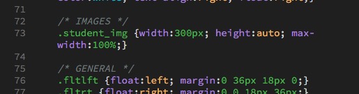
In this case, it would be better to create a class for the image, such as .student_img, and create an /* IMAGE */ subcategory in our css and place the measurements there.
In this case, the css would work much better if it were:
.student_img {width:200px; height:auto; max-width:100%;}
This is not ideal, since the page will have to wait for the image to load to know it's depth — all the more reason to optimize your images (make them as small as possible so they load quickly).
Note: Don't forget to remove the measurements from the <img> element once you've done this!
Hiding elements using display:none
Note: Something to realize is that you can add display:none (Instead of display:block, etc.) to your smaller media queries to completely hide elements that aren't important.
Download template2.html here.
Next part, we'll tackle the navigation elements and include a javascript to change from desktop menu to mobile menu.
Final Validation
If you are using Dreamweaver, look through the code for line numbers that are in red, indicating there is a problem. Click the red numbers and they should give you an idea what the problem is.
If Dreamweaver that you have unclosed elements and aren't sure what they are, you can insert your cursor before the </body> element at the bottom of your page, type </ and hit return, and it will auto complete whatever hasn't been closed. Look for those unclosed elements, close them, and try again until you get </body> right before </body>, and then you'll know all the unclosed elements. (Working on these instructions I had as many as six unclosed <p> elements I had to go back and find.)
Once you've fixed all the line number errors, go to File>Validate>Current Document (W3C) and your document will be validated.
W3C HTML Validator
If you don't have Dreamweaver, copy the code from your page, go to the HTML Validator at https://validator.w3.org/, paste your code in, and it will tell you on which lines your html has errors. Fix the code and repeat the process until you don't have any errors.
If you are having problems with your css, they also have a CSS Validator at https://jigsaw.w3.org/css-validator/.