Part 2: Building the structure in Dreamweaver
Go back to Dreamweaver and click on the Site folder in the Files pallet, go to options>File>New File and name the file "template". Double click on the template.html file you just created to open the file.
If you haven't already done so, set view to Split at the top and go to Split>Vertical (or whatever you have to do to switch it so preview is on the left and code is on the right).
At the top, after "<html" and before ">", type lang="en-US"
In place of the <title> "Untitled Document", type "Your Name's Harmonic Project"
Add a <style> and a </style> so you can add your css styles in the <head>.
- If you aren't working in Dreamweaver, create a copy of the template.html we created on the first day of class and place it in the template and open it.
- In place of the <title> "Untitled Document", type "Your Name's Harmonic Project"
Adding a non-printing image of the site in the background to build on
It's possible to add an image of the site you are intending to build in the background of your Dreamweaver page that won't display but will help you build a pixel-perfect version of your design. To do this:
- Using the Harmonic InDesign comp, go to File>Export, select your Images folder in the Harmonic Folder
- Under Format at the bottom, select "JPEG" and a jpeg of the page will be saved in the Images folder
- Go to your template.html file and go to File>Page Properties
- On the left, select Tracing Image
- On the right, select the jpeg you just created. You can then adjust the transparency of the tracing image.
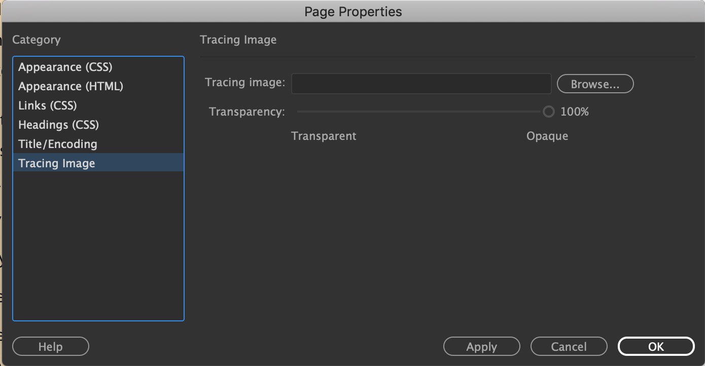
Note: This image will come in top left of the page. If you are going to set your site to center on the page using {margin:0 auto} or other means (see the code for #wrap below), don't add the centering until you're done using the template or it won't align properly.
Adding the "wrapper"
Now we'll build the structure of the document. We could create structure and add in the content as we go, but it's much easier to build the WHOLE structure, make sure it works, and then go in and add the content afterward, since we are fairly sure from the design that the text will fit. This allows us to troubleshoot problems with the structure without having to dig through all the text and images as well.
First, create a wrapping element to wrap around all the other elements we're going to create. This will keep them together and allow us to easily center them on the page.
After the <body> element (in other words, inside the body, where we keep elements that we want to display on the page), tab in one tab and create a <div> and give it id="wrap". (I'd recommend using an id instead of a class because "wrap" will only be used once on each page.) Hit return and close the </div>.
Let's start to add our css. Go up to the <style> in the head. First we'll add a star (*), which means it will apply to every element on our page. Then we'll add a simple reset using padding:0; margin:0;. Then we'll change how html measures the box model using box-sizing:border-box, because there are lots of elements, some with padding, and we don't want to calculate widths by including padding and borders. (We also know in advance that we're going to make this site mobile and simplifying the box model will make the site less likely to break.) Finally, we want to see what we're doing while we do it so we'll add outline:1px solid red;. So add:
* {padding:0; margin:0; box-sizing:border-box; outline:1px solid red;}
If you refresh the screen, you'll just see a red line all the way across the screen because it assumes it's 100% wide and we haven't given it a height.
Go back to InDesign. You'll see from the rulers that the width of this design is 1200px and the height is 1000px. Go back to your template page and add the "wrap" ID: #wrap {width:1200px; height:1000px; margin:0 auto;}
Dreamweaver Note: It's quite likely that now you will see nothing at all, because your website structure will be bigger than the window you're looking at. Click on the preview window and hit command-minus to zoom out until you can see the screen. (If the code is changing size instead of the preview, click on the preview window and try again.)
Command-minus also zooms out in a standard browser.
Adding the header and the navigation
In class so far we've been stacking the <nav> elements under the header; in this case we're going to add it inside the header. This is a matter of taste; in this case, if I wanted to create an alternate template page, I could just grab everything in the header and paste it on a new page, instead of worrying if I'd copied all of the header and all of the nav.
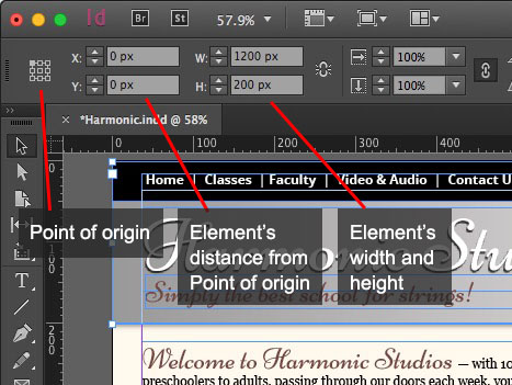
So let's go back to the InDesign document. Click on the gray header area at the top and look up at the toolbar at the top-left. First you'll see a grid that indicates the Point of Origin; click on the upper-left of the grid and that will tell InDesign to take measurements from the upper-left of an object, which is also how html pages take their measurements.
To the right of that is a column that gives you measurements of the object from the Point of Origin; in this case they should now read x=0px and y=0px. (Tip: If you want to move the Point of Origin from the upper-left corner of the page for any reason, click and hold on the area where the rulers join, and drag to where you want the point of origin to be.)
The next column shows the dimensions of the object(s) selected. (If more than one element is selected, the total width and height of the elements are shown.) In this case, the header width is 1200px and it's height is 200px. Next we do the same for the nav bar and InDesign tells us it's width is 1200px and height is 50px. Now let's go back to our template.
Adding the header and nav css
We'll add the html structure first, then add the css to style it.
In the body, inside the <div id="wrap">, tab once and add a <header> and close it; then inside the <header> tab once and add the <nav>.
In the <style>, add:
header {height:200px;}

				header nav {height:50px;}
Main and Aside
Next we address the main content areas. In this case, we'll use the elements <main>; and <aside> as the semantically logical element choices. Going to InDesign, we find their dimensions are: <main> 786px x 725px and <aside> 414px x 725px. We double-check our measurements by adding the widths: 786 + 414 = 1200. The heights are also the same.
Note: Because the content will change from page to page we will delete these heights eventually, but they are useful for now for us to see what we're doing.
Now, go back to your template, add the <main> and <aside> to the body and add:
main, aside {height:725px;}

				main {width:786px;}

				aside {width:414px;}
to your css.
Question: If you look, the <aside> has dropped down and now extends outside our wrap div. Why do you think that is? How do we fix it? (To see the effect better, add background-color:tan; to the css for aside. We'll change that color shortly.)
Float
Concept of floating
The basic structure of html sets most elements to the css of display:block; the way display:block appears is that, no matter what the width they are set to, they act like they are 100% wide, and therefore stack on top of each other.
One way to have the elements appear next to each other on the same row is to tell them to float. You can tell them to float:left or float:right. (Unfortunately, there is NO float:center; try it and you'll see.) What the elements will do is collapse to the width of what they contain or the width you tell them to be and move left or right. Note: Floated elementsy are also removed from the main flow of the document — like being moved to a different layer in a document — and the elements that are not floated will tend to act like the floated ones don't exist, often with very odd results.
History: When html was in it's infancy, when all it was used for was scientific documents, you only had the display:block attribute and, if you inserted an image in the text document, you had a block of text and then your photo and then another block of text, stacked. This wasted a lot of space. Floats were created to allow text to flow around photos, as we'll see when we start adding text to this template. As that is all floats were designed for and html is devoted to being backwards-compatible (in other words, every html document ever made works in the current version of html, so no scientific documents are lost), designers have had to work around this "floats outside the normal flow of the document".
Inquiry: Other ways have been created to display elements in line. Google "css ways to display elements inline" and see what you come up with. You might also search at Lynda.com for a tutorial on flex-boxes.
To get the <main> and <aside> to display next to each other, add
float:left;
to the css for main, aside.
Question: If you change the float from float:left to float:right; what happens? Why do you think it does that?
Footer and clearing floated elements
Go back to InDesign. When we select the <footer> it's 1200px x 75 px. Go to your template and add the <footer> element to your body and footer {height:75px;} to your css. The footer appears. But wait! Something's wrong. Add background-color:black; to the css for the footer to make sure. The footer is up at the top of the <main> and <aside>. Why is this?
Remember: floated elements are removed from the main flow of the document. So the <footer> is acting like the <main> and <aside> don't exist.
How do we fix this?
One way would be to tell the footer to float:left; then it will be on the same "level" as the other floated items and will act like they exist. Technical: The reason we don't want to do this is that we will be removing the height from the div wrap element so it can expand or contract with its content. If the last elements are floated, the div wrap will collapse to the height of the last un-floated element (since it is not floated). If we want to not have the div wrap collapse, we will need to add the clearfix hack to our css and then add the clearfix hack class to the div wrap.
Another way is to use "clear". You can tell a clear to be clear:left, in which case it will clear elements that are float:left; clear:right, which will clear elements that are float:right; and clear:both, which will clear all floated items. In this case it's best to add
clear:both;
to the css for the footer.
Also, because the footer is cleared and is the last item inside the div wrap, the div wrap won't need the clearfix hack css to keep from collapsing.
Finally we'll go up and remove the height from the #wrap, because with the clear on the <footer>, the #wrap won't collapse.
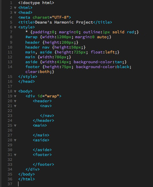
Your code should look like this:
Coloring the elements
Picking the colors from InDesign
To color the elements, we'll go back to the InDesign file. I used the Color Theme Tool on the picture of the violin and the picture of the student to create color pallets for the project, but we also have a gradation in the header to add.
Go back to the InDesign file, click on the elements, and look at the Swatches pallet to the left to identify the colors. Note: If all the rgb values are the same number, they'll be a neutral gray; if they are all zeros they'll be black, if they are all 255 they'll be white.
The <nav> is black, so go to the css and add to header nav {background-color:#000;}.
The <main> is rgb 255, 249, 237, so to the css for main add background-color:rgb(255, 249, 237).
The <aside> is rgb 162, 112, 107, so to the css for aside change the background-color from tan to rgb(162, 112, 107).
The <footer> is rgb 140, 59, 52, so to the css for the footer change the background-color from black to rgb(140, 59, 52).
Picking colors from the gradient tool in InDesign
Finally, go to the header in InDesign. You'll need to go to Window>Color>Gradient to open the Gradient pallet. Also click on the Swatches pallet in the pallet list on the right side of your InDesign workspace.
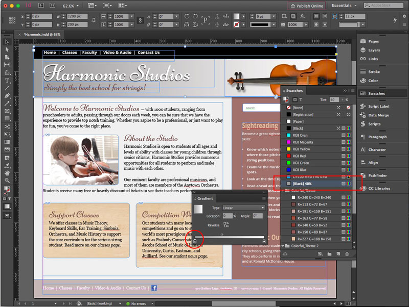
When you click on the tiny swatch at the bottom-right of the Gradient pallet under the gradient, you will see that it has selected the [Black} 40% swatch on the Swatches pallet. Not much use for getting an rgb color from, but if you hover your cursor over the [Black] 40% swatch, it will give you an rgb value of rgb(153,153,153). If you click on the swatch at the bottom-right of the Gradient pallet it will tell you that the value is Paper, which in this case is white. So the rgb value would be what? Read the paragraph about the <main> color above to get the answer.
We also need to get the size for the violin, because we're going to include it in the <header>. Take the black arrow, click on the violin to select it, and go to Object>Fitting>Fit Frame to Content. The box will now be the size of the image; note that it is 758px from the left side of the page, 47px from the top, and 470px wide x 178px high.
Creating a multi-layered header background in Dreamweaver
In css, it's possible to create multi-layered backgrounds. Many times it's just as easy to create a collage in Photoshop and export a single image (not to mention it'll load faster), but here we'll use Dreamweaver to help us place the violin on a gradated background.
Given that you didn't even know you could add images to backgrounds, let alone multi-layered ones, we'll take this one step at a time. In Dreamweaver you can only add an iage and a background gradation. If you want to do more layers you will have to hand code them.
In order for the images to layer properly in css, we need to add the top image first, followed by the next image, below it, followed by the next image below that, and so on. So the first thing we need to add here is the image of the violin.
Instead of adding the image first, it makes more sense to create the gradation first when handcoding. See note at the end of this section before reading this.
Add the violin FIRST
- To add the violin, go to Dreamweaver and select the header in the preview on your left.
- Click the CSS Designer tab in the top-right of your screen and you should see "header" selected under "Selectors".
- Turn off "Show Set" and click the icon for Background to the left of it.
- Look down the list and find "background-image" and under that "url". Click the folder to the right, go to the images folder, select images/iStock_3009680_violin.png and click "open".
- What you will see is the violin image full-size and repeated across the header. (The default for background-images is to repeat infinitely on the x- and y-axis.)
Now we'll style that violin.
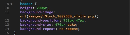
- Again under background-image, look for background-position.
- Type in 758px, which is the number of pixels from the left side of the header, and 47px, which is the number of pixels from the top of the header.
- Next, go to background-size and set the horizontal dimension to 470px and leave the second dimension as auto. You'll notice the violin is smaller.
- Finally, go to background-repeat and click the single square, the last one in the list, and you will only have one violin in the header. The result should look very similar to the InDesign header.
Your code should look like this:
Then add the gradient
Now look back up under "url", see "gradient", and click the "None" indicator (white block with red slash through it).
You'll get a gradient pallet like this:
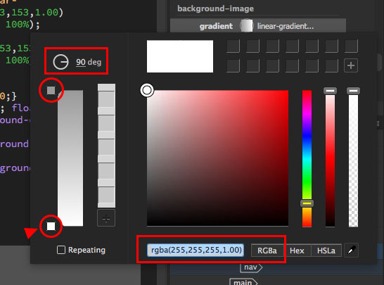
Change the gradient angle to 90-degrees.
- Click the top-left swatch and type into the rgba values at the bottom 153, 153, 153.
- Click the bottom-left swatch and type into the rgba values at the bottom 255, 255, 255.(We got both values from InDesign, remember?)
- Hit return and under the header css you should see:
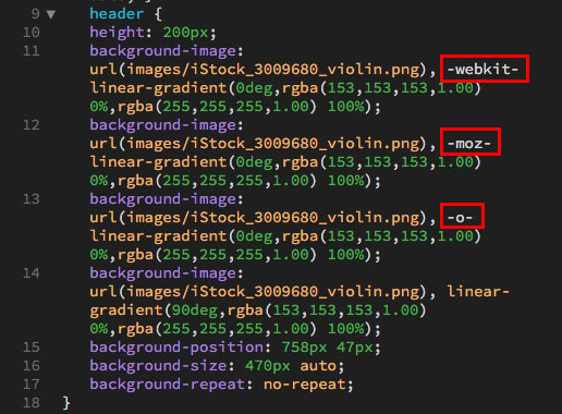
But why do we now have four copies of the code?!?
Where I've outlined the code are browser-specific prefixes. -webkit- is for Safari and Google Chrome; -mo- is for Firefox, and -o- is for Opera. These are fallbacks for earlier versions of these browsers that might not support the current specification for linear-gradient. This is a disadvantage of using new features; sometimes you have to add browser-specific versions.
Note: the unprefixed code has the degrees as 90, while all the others are zero, so if the prefixes aren't included your gradient might not show up angled correctly.
It's simpler to do the gradient first when handcoding because it's easier to add the code for the image to the four gradients than to add the four gradients to the image code.
To get the gradation, try Colorzilla Gradient Generator.
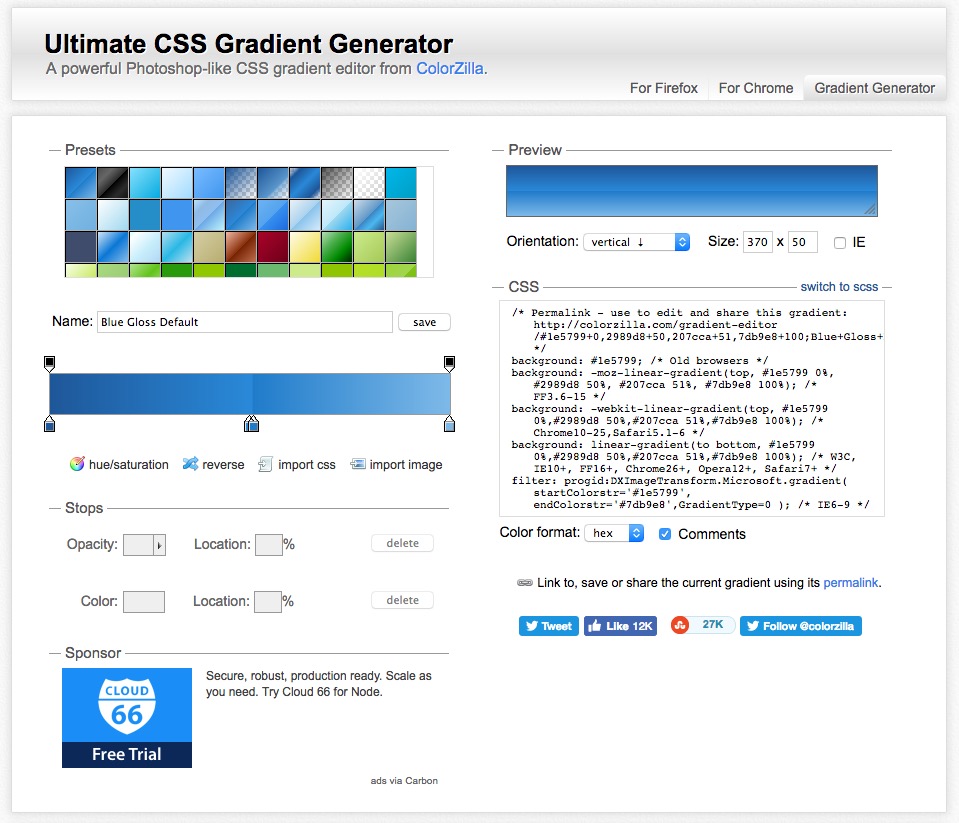
Changing the direction of the gradation is at top-right under Preview, and the Color Format setting — such as rgba if you want transparency — is under the css code. You'll notice that the code generated by Colorzilla also includes a link back to this gradient, in case you want to edit it later, and a Filter that helps some versions of Internet Explorer display gradients. Select all the css and paste it into your header attributes similar to the Dreamweaver sample above.
Then, to add the image, after the first "background-image:" type "url(image link)," (so the image is before the gradation), then copy that section and paste it on the other three lines.
Fixing the header gradient background
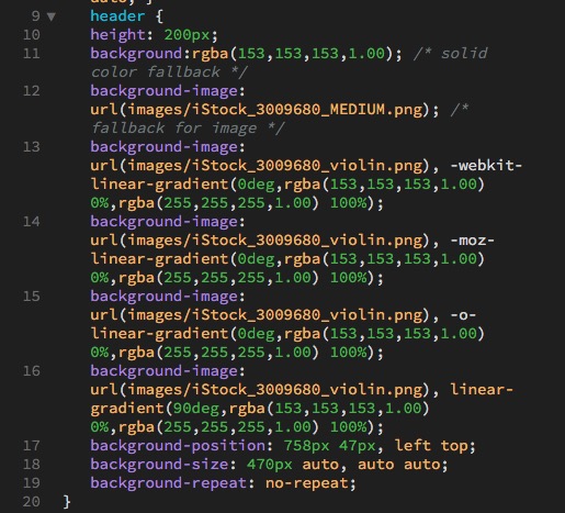
Look at the preview. The gradient is small and off-centered, just like the violin. The reason is that we are using the same background-position and background-size for the gradient as for the background. To fix this, we have to add to the css. Change the css to:
 background-position: 758px 47px, left top;

					background-size: 470px auto, auto auto;
The first pair are for the image, there's a comma, and then the second pair are for the gradation.
Header background gradient fallbacks
To be thorough, in case a browser doesn't understand the gradient, we need to add fallback css. After height: 200px; add:
background:rgba(153,153,153,1.00); /* solid color fallback */
Then we add:
background-image: url(images/iStock_3009680_MEDIUM.png); /* fallback for image */
so if the multiple background-images don't work we should get a gray background with the violin on top.
The finished code looks like this:
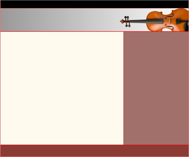
And the page in Dreamweaver should looks like this:
Creating a body background gradation
Finally, let's add a gradation and a background image to the <body>, so our website isn't just floating in space. This will be a little dark compared to current tastes; but will give you the idea. Go ahead and copy and add this css:
 body {

				background-color: rgba(55,55,55,1.00);

				background-image: -webkit-linear-gradient(270deg,rgba(35,35,35,1.00) 0%,rgba(45,45,45,1.00) 26.97%,rgba(55,55,55,1.00) 100%);

				background-image: -moz-linear-gradient(270deg,rgba(35,35,35,1.00) 0%,rgba(45,45,45,1.00) 26.97%,rgba(55,55,55,1.00) 100%);

				background-image: -o-linear-gradient(270deg,rgba(35,35,35,1.00) 0%,rgba(45,45,45,1.00) 26.97%,rgba(55,55,55,1.00) 100%);

				background-image: linear-gradient(180deg,rgba(35,35,35,1.00) 0%,rgba(45,45,45,1.00) 26.97%,rgba(55,55,55,1.00) 100%);

				background-repeat:no-repeat;
				}

				}
This will give you a dark background with a vertical darker gradation at the top. The default is a solid dark gray.
Final Validation
If you are using Dreamweaver, look through the code for line numbers that are in red, indicating there is a problem. Click the red numbers and they should give you an idea what the problem is.
If Dreamweaver that you have unclosed elements and aren't sure what they are, you can insert your cursor before the </body> element at the bottom of your page, type </ and hit return, and it will auto complete whatever hasn't been closed. Look for those unclosed elements, close them, and try again until you get </body> right before </body>, and then you'll know all the unclosed elements. (Working on these instructions I had as many as six unclosed <p> elements I had to go back and find.)
Once you've fixed all the line number errors, go to File>Validate>Current Document (W3C) and your document will be validated.
W3C HTML Validator
If you don't have Dreamweaver, copy the code from your page, go to the HTML Validator at https://validator.w3.org/, paste your code in, and it will tell you on which lines your html has errors. Fix the code and repeat the process until you don't have any errors.
If you are having problems with your css, they also have a CSS Validator at https://jigsaw.w3.org/css-validator/.