Part 3: Mobile
For this next part, we're going to take the basic structure and make it mobile-ready, after adding some accessibility features.
WAI-ARIA
The first thing we are going to do is add some WAI-ARIA "roles" to make our site more accessible to blind and vision-impaired web-surfers. Roles allow people who use audio cues instead of visual cues to navigate around the site more easily.
I recommend watching the short tutorial on WAI-ARIA at Lynda.com's HTML ESSENTIAL TRAINING > Using WAI-ARIA roles. You can also find out more about them at Specificaiton for WAI-ARIA, AIA in HTML, and _____ .
We'll be adding roles from https://www.w3.org/TR/wai-aria/roles#landmark_roles. You'll notice that these roles are very much like if not identical to the semantic elements we'll be adding them to; in fact the W3C did this on purpose. This may seem like a duplication of effort, but screen readers may or may not recognize semantic elements, so it's far safer to include both.
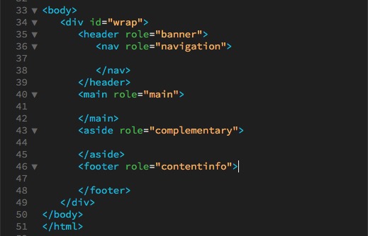
To add a role, you add them to the html elements much like you add ids and classes. For instance, to a <main> element, the correct addition of a role would look like <main role="main">. Here are the roles to add to the document.
- <header role="banner">
- <nav role="navigation">
- <main role="main">
- <aside role="complementary">
- <footer role="contentinfo">
The structure should now look like this:
Translation
Another form of accessibility is the language your site is written in. The ideal solution would be to have your site professionally translated into other languages used. A simpler, less perfect choice is to use Google Translator. Go to Google Translator, create a Google account if you don't have one, log in, give the address of your website, and Google will provide you with a <div> containing a button and a script to add to your site that will allow the user to pick the language they want your site translated into.
Mobile
Viewscreens
It used to be that desktop computers were the only way you could look at a website. Though some sites still act like that's true (see this site for SpaceJam from the 1990s), it couldn't be farther from the truth. Nowadays, sites have to fit on a wide variety of screen sizes, so we're going to have this site do some resizing tricks.
The first thing we have to do is have the site view correctly on a mobile phone. To do that, we have to add some code to the <head> element right after the <meta charset="utf-8">:
<meta name="viewport" content="width=device-width, initial-scale=1">
On a computer, the size of the screen is the size of the screen. On a mobile device, the size of the screen is not necessarily the size of the screen; it can be bigger. This command tells the mobile device that the size of the screen is the width of the screen on that particular device, and to fit the site to that screen size.
iPhone Horizontal Viewport
The iPhone horizontal orientation often renders font sizes larger than you specified.
Add this code at the beginning of your css styles to prevent that problem:
html {-webkit-text-size-adjust: 100%;}
Media Queries
The way we make the site is by using a combination of "media queries" and percentages to make the site responsive. A media query looks like this:
@media screen and (max-width:value) {
	selector1 {attribute:value;}
	selector2 {attribute:value;}
	selector3 {attribute:value;}
}
where the @media query wraps around and controls css selectors and their attributes. In this case, screen would be any device that uses a screen (another common one is "print", for when you are going to print out a website and you might want to hide things like navigation). If the screen width value is max-width:1200px, that means that the css in the media query will only apply when the screen width is 1200px or smaller. Make the screen any larger, and these css specifications won't show up.
You can also use min-width; I suggest you ONLY use max-width or ONLY use min-width for the screen widths of your media queries, to make your media queries easier to understand.)
Note: DO NOT add a semicolon after the value in the parenthesis (like you normally would in a css statement); adding a semicolon there will break the media query.
Break at 1200px
For this site, we've set the div #wrap to be 1200px wide. But if our screen is less than 1200px, our site starts to get cut off (make your browser screen narrower and you can see this happen.). So how do we prevent this?
We're going to set two different breakpoints for this site right now. (We'll see problems with other elements when we start adding content, but this should get us started.)
First, let's add this media query to the end of our css:
@media screen and (max-width:1200px) {
	#wrap {width:786px}
}
We are starting there because 786px is the width of our <main>.
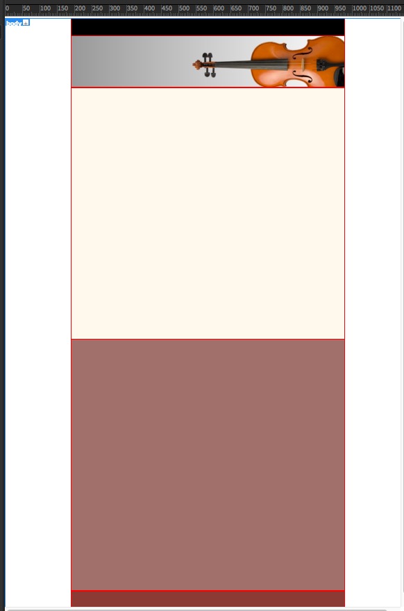
Next we'll adjust the violin position (though it may not work when we add the headline): the x position is 758px - 414px (width of the aside) = 344px, so within the media query add:
header {background-position: 344px 47px, left top;}
Then we'll set the <aside> to a width of 100%. So within the media query add:
aside {width:100%;}
At less than 1200px, the structure will look like this:
Break at 786px
The final break for right now will be at 786px, the width of our <div id="wrap"> and <main>. The media query will look like this:
@media screen and (max-width:786px) {

				#wrap, main {width:100%}

				}
So when the width of the browser hits 786px, which was the fixed width of the div wrap and the <main>, they will change to 100% of the width of the browser. (The <header>, <nav> and <footer> were already set for width:100%;) At this point, we will definitely need to eliminate the violin from the header, so we should also add css for the header, so the total will look like this:
@media screen and (max-width:786px) {

	#wrap, main {width:100%}

	header{
		background:rgba(153,153,153,1.00); /* solid color fallback */

		background-image: -webkit-linear-gradient(0deg,rgba(153,153,153,1.00) 0%,rgba(255,255,255,1.00) 100%);

		background-image: -moz-linear-gradient(0deg,rgba(153,153,153,1.00) 0%,rgba(255,255,255,1.00) 100%);

		background-image: -o-linear-gradient(0deg,rgba(153,153,153,1.00) 0%,rgba(255,255,255,1.00) 100%);

		background-image: linear-gradient(90deg,rgba(153,153,153,1.00) 0%,rgba(255,255,255,1.00) 100%);

		background-position: left top;

		background-size: auto auto;

		background-repeat: no-repeat;

		}

	}
The 786px version of the site will just have solid color bars across the browser page and no violin in the <header>.
We'll have to make further adjustments to these media queries as we add content to this template, but this gives us a start.
Bootstrap
Once you have familiarized yourself with using media queries, you can try an html framework like Bootstrap. Bootstrap is designed as a way to "quickly" build mobile websites. It actually takes a fair amount of study to understand all the classes and what they do; it also includes lots of code you may never use. But it's a popular way to build mobile sites without starting from scratch. Note: It would also be useful to look over the code for Bootstrap for techniques for dealing with common mobile problems.
Final Validation
If you are using Dreamweaver, look through the code for line numbers that are in red, indicating there is a problem. Click the red numbers and they should give you an idea what the problem is.
If Dreamweaver that you have unclosed elements and aren't sure what they are, you can insert your cursor before the </body> element at the bottom of your page, type </ and hit return, and it will auto complete whatever hasn't been closed. Look for those unclosed elements, close them, and try again until you get </body> right before </body>, and then you'll know all the unclosed elements. (Working on these instructions I had as many as six unclosed <p> elements I had to go back and find.)
Once you've fixed all the line number errors, go to File>Validate>Current Document (W3C) and your document will be validated.
W3C HTML Validator
If you don't have Dreamweaver, copy the code from your page, go to the HTML Validator at https://validator.w3.org/, paste your code in, and it will tell you on which lines your html has errors. Fix the code and repeat the process until you don't have any errors.
If you are having problems with your css, they also have a CSS Validator at https://jigsaw.w3.org/css-validator/.